
I speak of course, of THE COLOR GRADING VIRUS THAT IS TEAL &ORANGE!!!
This is the insidious practice of color-grading every movie with a simplified, distilled palette of teal and orange like this:


Or this:
So how did we get here, you may ask. Well, it's a sad and sordid tale my friend, the combination of new digital technology and a good idea gone bad.

The Cohen brothers ushered in the new era of digital color grading with their excellent 2000 film, "Oh Brother, Where Art Thou."
But was that power used for good... Nooooooooooooooo, or course it wasn't!
Some unnamed yahoo decided that the only acceptable look for a movie these days is this:

This screenshot from the excellent color theory and exploration site,kuler, shows what happens when you apply complementary color theory to flesh tones. You see, flesh tones exist mostly in the orange range and when you look to the opposite end of the color wheel from that, where does one land? Why looky here, we have our old friend Mr. Teal. And anyone who has ever taken color theory 101 knows that if you take two complementary colors and put them next to each other, they will "pop", and sometimes even vibrate. So, since people (flesh-tones) exist in almost every frame of every movie ever made, what could be better than applying complementary color theory to make people seem to "pop" from the background. I mean, people are really important, aren't they?
(By the way, filmmaker and tech guru Stu Maschwitz does a great job of explaining the nuts and bolts of how this is done on his blog, ProLost.)
From this seemingly innocuous supposition was unleashed a monstrosity that would eventually lead to one of the worst films ever, and one of the worst examples of unchecked teal and orange stupidity:
Yes, Transformers 2.
This movie took this color-look to extremes that only Michael Bay could vomit up. Behold!

Take a look at a few trailers of current and upcoming movies and you can see that the look is now firmly entrenched:
Let's see, summer blockbuster movie Iron Man 2:


Yup. How about recent horror flick - Wolfman:

Check. Now, Wolfman at least has the respectability to be a little more subtle in its palette, but it is still there nonetheless. Also, sometimes it will trade off and do one shot all orange (or gold) and one shot all teal (or blue):


How about upcoming retread flick Tron? Now this movie can look any way it wants - it's set inside a computer for cripes-sake! Imagine the limitless possibilities of fantastic color design:


Oh hell, I give up!
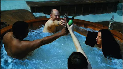
This infection would be ok if it was limited to only mindless summer action flicks but I'm afraid that's not the case. How about the fun new "Hot Tub Time Machine"?


Wow, I sure don't remember 1980 looking like that. In fact, nothing ever has looked like that because it's physically impossible. You see, in order to get flesh tones to look that warm and orangey, the entire image would look warm and orangey - like golden hour, just before sunset. And in order to get teals to look that blue and tealey, the entire image would look cold and blue - like at night. Never in real-life shall the two meet - at least not in this exaggerated way:

Geez Chevy, what have they DONE TO YOUR FACE!!
Please people, spread the word and fight. Fight against this horrible visual injustice. If nothing is done, we will never see our friends green, or purple, or even red again. Imagine a world without red people! It could be right around the corner. Our whole world will look like this:

AAAAAHHHHHHHH I can't take it any more!
Seriously, I weep for cinema of this dark age. I think twenty years from now people will look at films of this era and say "My God - what were they smoking??!?"
I leave you with this last horrible thought. What would art history look like if this virus had infected mankind hundreds of years ago?


No comments:
Post a Comment